 Trading Reps
Lesson 13 of 31 · Zero to reading a chart
Chart Timeframes: One Day, Three Pictures
The same six and a half hours in three box sizes give three true pictures - a morning, a shape, one candle in a row - and traders read the bigger one first, because the small chart decides what you think before you have any context.
This chart is one day. So is this one. So is this one.
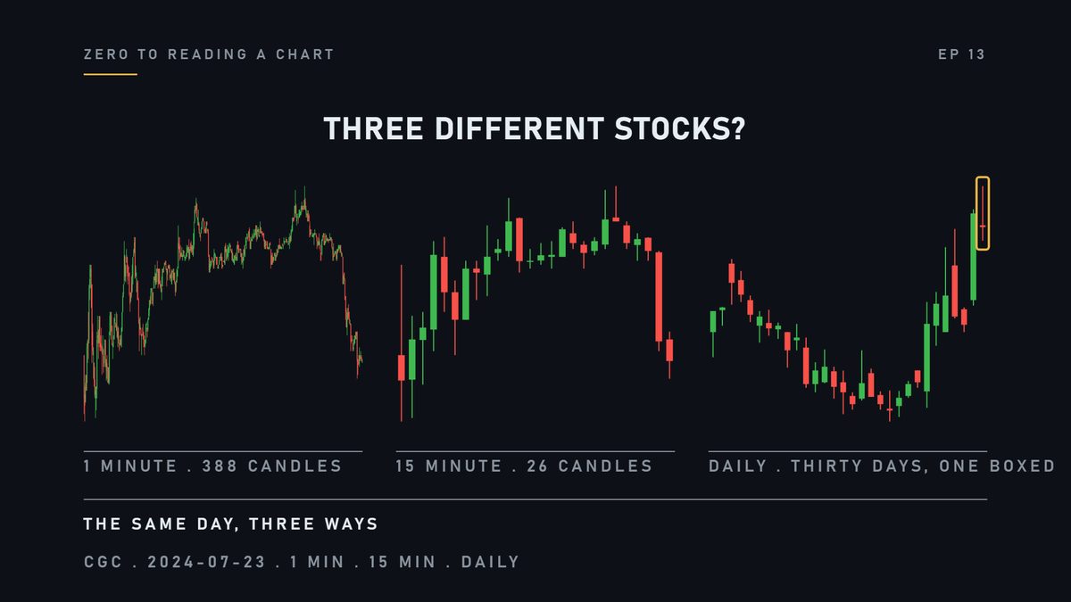
Same company, same day. So why do they look like three different stocks?
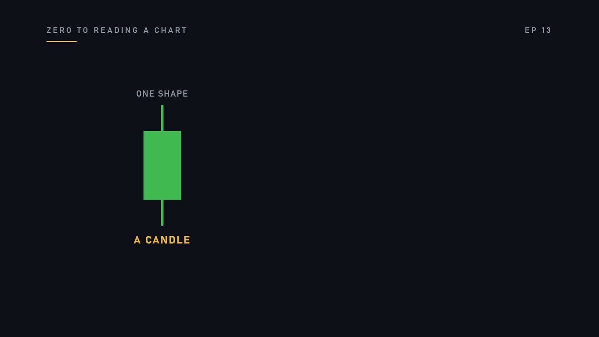
Quick reminder, in case you need it. Each of those shapes is a candle.
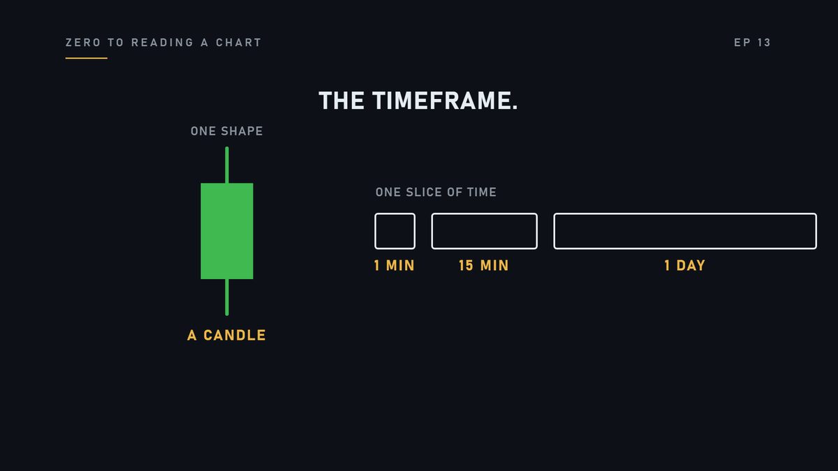
A candle covers one slice of time. One minute, fifteen minutes, a whole day. That slice is called the timeframe.
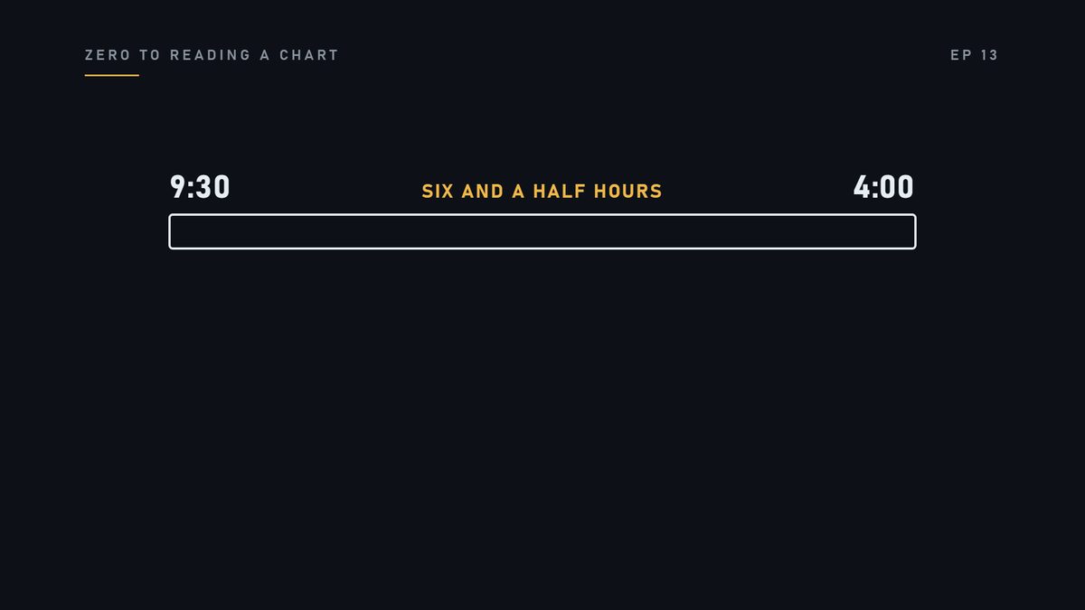
And you know the trading day is six and a half hours.
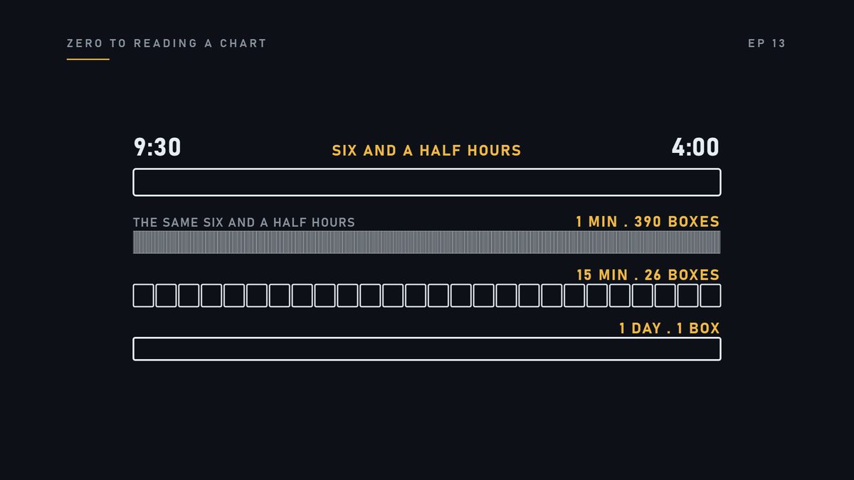
Watch what happens when those same hours go into three different boxes.
Here is the one-minute chart. Nearly four hundred candles. One for every minute the stock traded.
You can see the morning. You can see a quiet stretch. You can see the last hour.
Same day, fifteen-minute candles. Twenty-six of them now.
The minutes are gone. What is left is a shape.
Same day again. One candle. That is the whole session, on a daily chart.
Sitting next to yesterday, and the day before.
Nothing was added. Nothing was removed. The same trades are in all three. Only the size of the box changed.
The one-minute shows you a morning. The fifteen-minute shows you a shape. The daily shows you one candle in a row of candles.
All three are true at the same time.
Traders use them together, and they use them in an order. The bigger timeframe is the context: where you are.
The smaller one is the detail: what is happening right now.
You look at the big one first. If you start small, the small chart decides what you think. Before you have any context.
Here is the mistake. Somebody looks at one chart, on one timeframe, and treats it as the truth.
A day can look violent on the one-minute. And completely ordinary on the daily. Same day. Both pictures are real.
Watch. This is a different session. On the daily chart, the body is small. It closed near where it opened.
On the one-minute, it was a mess all morning.
Next time you look at a chart, find the timeframe label first. Read it out loud.
Remember this. Zooming out is not a neutral act. Pick the timeframe on purpose.
Check yourself
- Which chart shows you a morning?
- The one-minute.
- Are the trades different on the two charts?
- No. Same trades, different sized boxes.
- Which one is the context, bigger or smaller?
- The bigger one.
Next lesson: Every +5% you've ever seen is measured from one number.
For learning only. Not financial advice, not signals, not stock picks.